Responsive Images with Srcset and Sizes
Updated:
Continuing on from the optimising web performance blog post about removing render-blocking resources. This post will focus on serving responsive images.
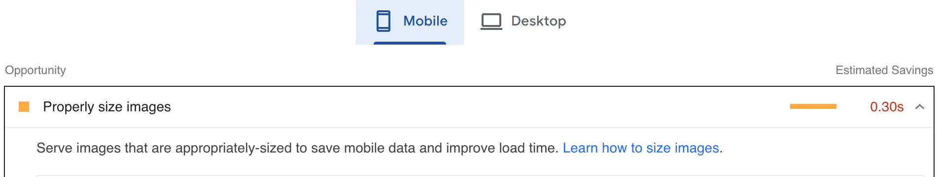
When I tested my Minimalist Hugo theme performance using Lighthouse in the Dev tool (keyboard shortcut Option + Command + I in Mac), the Opportunities section of the Lighthouse report shows “Serve images that are appropriately sized to save mobile data and improve load time.”
What does that mean?
It means I just used one image size to serve up to every screen size, from mobile to desktop.
That’s a no- no in 2023!
Well, before mobile phones came along, people surfed the web using desktops and laptops. There wasn’t a need to resize the image or tell browsers to serve up different images based on the device’s screen. Compared to these days, where we have many screen sizes for mobile phones and tablets, serving one sized image wouldn’t cut it.
From the last post, we learned that the slower the site loads, the less conversion a website has. If we served up one size of an image to every screen size, it would deliver too much image data and affect the speed of loading on mobile devices.
How do we create responsive images?
We need to create different image sizes for different screen devices.
This is a common format we’ve seen for serving one image.
<img src=sunflowers.jpg" alt=”Beautiful sunflowers" />
To let the browser choose the right image that fits a certain condition (screen width) we can use
srcset and sizes attributes.
<img
  srcset="sunflowers-480w.jpg 480w, sunflowers-800w.jpg 800w"
  sizes="(max-width: 600px) 480px, 800px"
  src="sunflowers-800w.jpg"
  alt="Beautiful sunflowers" />
Srcset
Srcset allows the browser to pick one of the sources (file name) and the width we provide
which is separated from one another by a comma. Notice that we use a w unit, not a px unit.
The browser doesn’t know an image’s width and height before it loads unless we specify them. That’s why when we use w descriptor, it can determine which one to use.
W is the actual width of an image, for example, If the image is 480px, we would write 480w.
Note that you need to generate different sizes of an image yourself.
Sizes
sizes tell the browser which condition to satisfy to serve up a certain size of an image.
In the example above, If the viewport is equal to or less than 600px (the condition is true), then
sunflowers-480w.jpg will be loaded. This saves a lot of bandwidth for mobile users.
Basically, it’s a way to tell the browser how big an image will be at a certain screen size by using a media query. The browser won’t download all the images that we specify, it just downloads the one that fits the condition.
If the browser doesn’t support srcset, it will fall back to using the src attribute. The browser will do its own calculation to display an image based on the size of the display screen.