How to create a triangle with pure CSS
Updated:
How to create a triangle with pure CSS
There is a time when I want to create a simple triangle, either as an indicator for a dropdown or as an arrow for left and right for pagination. What if I don’t want to add and maintain external libraries or complex SVG? Well, I can just do that with pure CSS.
This is how I would create it. Let’s start with one div with tri (short for triangle) class.
<div class=”tri”></div>
Then I create a square with very thick borders. For normal styling I would just use 1px or 2px for borders to differentiate each elements. But What if I add thicker borders like 20px?
.tri {
  height: 20px;
  width: 20px;
  border-top: 20px solid blue;
  border-right: 20px solid green;
  border-bottom: 20px solid orange;
  border-left: 20px solid red;
}
I use different colours for each side of a border, so it is easier to see where one edge ends and the next begins. Below is what I got so far.

Let’s have an experiment to see what would happen if I set the height and width of the square to 0.
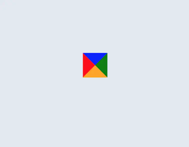
All the borders come together and join in the middle. Now I can see that each border forms a triangle. The size of an arrow is determined by the width of a border. In this example I used 20px.
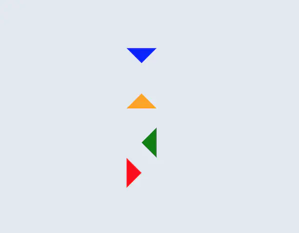
For example, if I want a down arrow, I can use a top border and use transparent as a colour for
the rest. The same principle applies to other arrows.
.arrow-down {
  height: 0;
  width: 0;
  border-top: 20px solid blue;
  border-right: 20px solid transparent;
  border-bottom: 20px solid transparent;
  border-left: 20px solid transparent;
}
Here are an example what can be achieved.