Responsive News-Style Layout
I’ve been experimenting with various layouts using only HTML and Tailwind CSS. One of my favourites is a magazine-style or news-style layout.
I drew inspiration from the BBC News website and want to recreate it.
The main challenge was ensuring the layout remained fully responsive across different screen sizes.
Layout overview
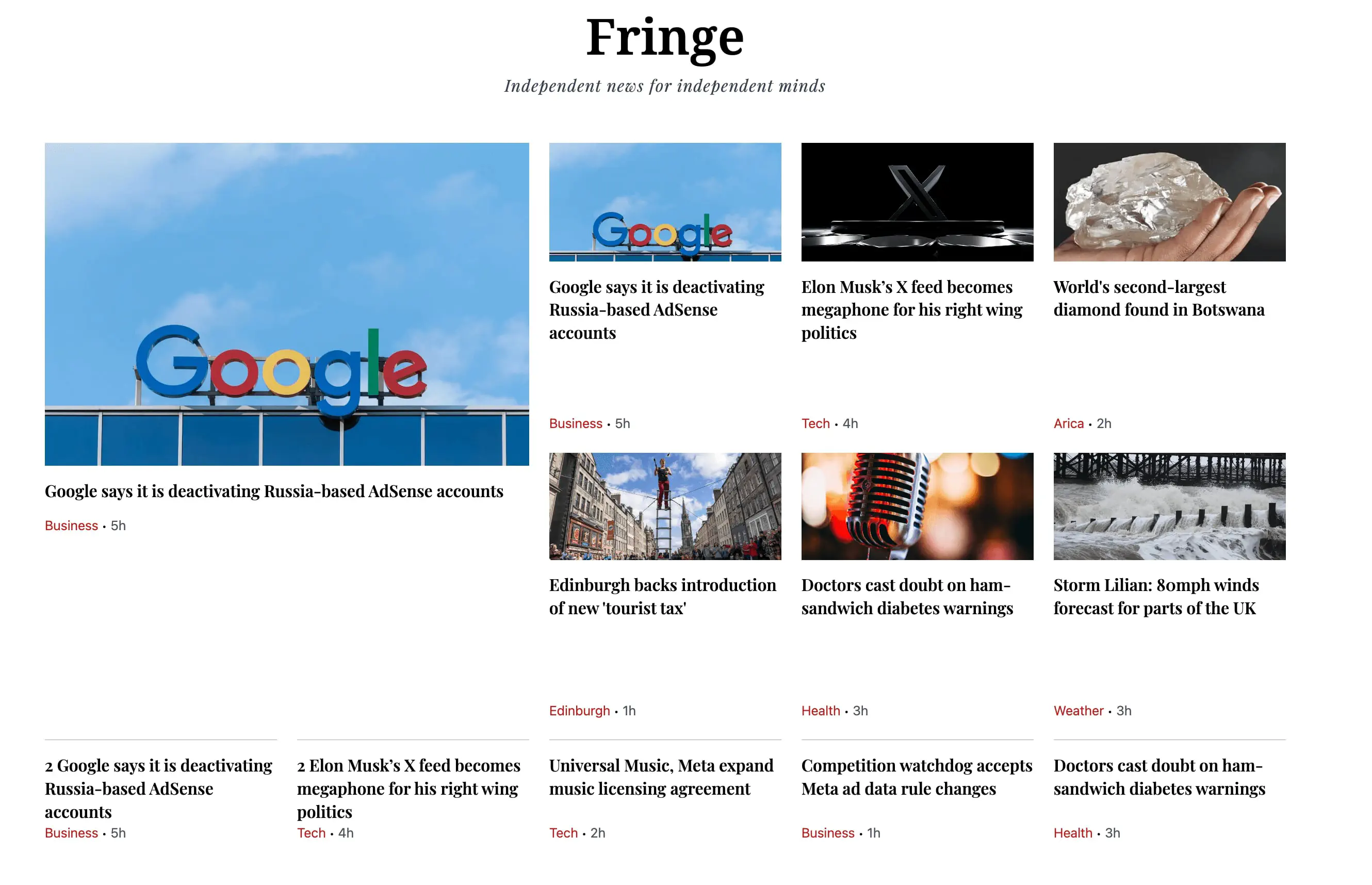
1. Structure and responsiveness for a featured news article and primary news articles
The entire section is wrapped in a CSS Grid container.
On small screens (width >= 40rem), the grid starts with two columns, making the layout simple and stacked.
On large screens (width >= 64rem), it expands to four columns, and on extra-large screens(width >= 80rem), it grows to five columns, ensuring the design adapts seamlessly to different devices.
Gap spacing between cards keeps the content visually clear and readable.
2. Featured news article
The main headline story is displayed on the left, using
col-span-2 row-span-4. This makes it twice as wide and taller than the other cards, drawing immediate attention.Includes a large image, headline, category, and timestamp to make it stand out as the most important news.
3. Primary news articles
Placed to the right of the featured story in medium-sized cards.
Each primary article uses row spanning to align neatly with the grid’s vertical rhythm.
These cards include an image, headline, and quick category/timestamp markers.
They serve as secondary highlights that are still visually prominent.
4. Secondary News
Positioned below the primary news items.
On small screens, each secondary story spans the full width of the grid section
(col-span-2).On larger screens, they reduce to one column wide and align perfectly with the grid above.
A thin top border separates them from the rest of the content, subtly indicating a change in priority.
5. Most watched section
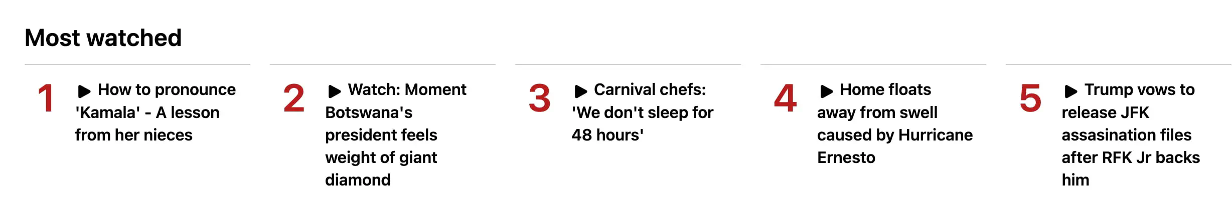
Numbers in bold red immediately convey ranking.
Icon + title pairing reinforces that these are videos.
The grid layout ensures the list feels compact on small screens but expansive on large displays.
Borders between items help separate each entry without adding visual clutter.
6. Visual Flow
The featured story anchors the left side of the page, immediately grabbing attention with its larger size and dominant image.
Primary stories occupy the top-right area, guiding the reader’s eyes horizontally across the grid.
Secondary stories sit below the primary items, offering additional content in a balanced, evenly spaced arrangement.
The Most Watched section follows underneath, switching the focus from general news to trending video content, with clear ranking numbers and a compact grid that adapts to screen size.
The consistent use of images, typography, spacing, and responsive grid structure makes the overall layout easy to scan and visually engaging.